ColumnsControls component
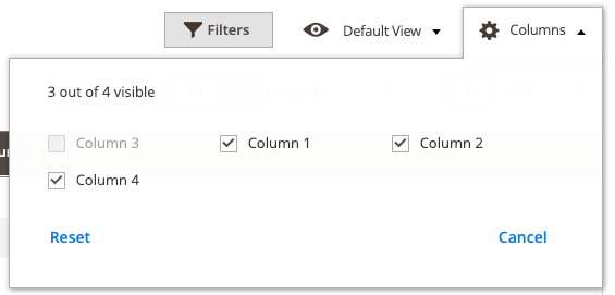
The ColumnsControls component is a collection of columns. It provides an interface for showing and hiding columns. The interface contains:
- The total number of all available columns in a grid.
- The number of columns currently active/displayed.
Configuration options
| Option | Description | Type | Default Value |
|---|---|---|---|
minVisible |
Minimum number of columns that must be visible. | Number | 1 |
maxVisible |
Maximum number of columns that can be visible. | Number | 30 |
template |
The path to the component’s .html template. |
String | ui/grid/controls/columns |
Source files
Extends uiCollection:
app/code/Magento/Ui/view/base/web/js/grid/controls/columns.jsapp/code/Magento/Ui/view/base/web/templates/grid/controls/columns.html
Example
Changing “minVisible” and “maxVisible” values in the javascript file.
To change attribute values, override the vendor JS file in a custom module:
/vendor/magento/module-ui/view/base/web/js/grid/controls/columns.js
Step one: override the javascript file
In /app/code/[VENDOR_NAME]/[MODULE_NAME]/view/base/requirejs-config.js, add the following:
1
2
3
4
5
6
7
var config = {
    map: {
        '*': {
            'Magento_Ui/js/grid/controls/columns':'VENDOR_NAME_MODULE_NAME/js/grid/controls/columns'
        }
    }
}
Step two: set the custom values
In /app/code/[VENDOR_NAME]/[MODULE_NAME]/view/base/web/js/grid/controls/columns.js, change the “minVisible” and “maxVisible” values as needed:
1
2
3
4
5
6
7
8
9
10
11
12
13
14
15
16
return Collection.extend({
        defaults: {
            template: 'ui/grid/controls/columns',
            minVisible: 1,
            maxVisible: 4,
            viewportSize: 18,
            displayArea: 'dataGridActions',
            columnsProvider: 'ns = ${ $.ns }, componentType = columns',
            imports: {
                addColumns: '${ $.columnsProvider }:elems'
            },
            templates: {
                headerMsg: $t('${ $.visible } out of ${ $.total } visible')
            }
        }
    });
Result