Button component
The Button component allows user to perform a list of predefined actions by clicking on the corresponding button. Its default display mode is the HTML <button> element, which be configured to display a link.
Configuration options
| Option | Description | Type | Default |
|---|---|---|---|
component |
The path to the component’s JS constructor in terms of RequireJS. | String | Magento_Ui/js/form/components/button |
additionalClasses |
Sets custom classes to the component’s DOM block. | Object | {} |
buttonClasses |
Sets custom classes to the HTML <button> element. |
Object | {} |
disabled |
Initial component’s state. When set to true, users can’t take action on the element. |
Boolean | false |
displayAsLink |
Show the button as a link. | Boolean | false |
elementTmpl |
The path to the child component’s .html template. |
String | ui/form/element/button |
template |
Path to the general .html template for a button. |
String | ui/form/components/button/simple |
title |
Button title. | String | '' |
displayArea |
Display area of the component. | String | outsideGroup |
visible |
Initial component’s visibility. When set to false, the "display: none" CSS style is added to the component’s DOM block. |
Boolean | true |
actions |
A list of actions that are performed when user clicks on the element. | ButtonAction[] |
- |
ButtonAction interface
| Option | Description | Type | Required |
|---|---|---|---|
targetName |
Reference to component. | String | Required |
actionName |
Name of the component’s method to be invoked. | String | Required |
params |
A list of arguments that will be passed to the method. | Array | Optional |
Examples
Configure component
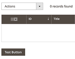
Here is an example of a Button component (“Test Button”) added below a Listing component:
1
2
3
4
5
6
7
8
9
10
11
12
13
14
15
16
17
18
19
...
<button name="my_new_button">
    <argument name="data" xsi:type="array">
        <item name="config" xsi:type="array">
            <item name="actions" xsi:type="array">
                <!-- Add your button's actions here -->
                <item name="0" xsi:type="array">
                    <item name="targetName" xsi:type="string">TARGET_NAME</item>
                    <item name="actionName" xsi:type="string">ACTION_NAME</item>
                </item>
            </item>
        </item>
    </argument>
    <settings>
        <displayAsLink>false</displayAsLink>
        <title><![CDATA[Test Button]]></title>
    </settings>
</button>
...
Result
The Button component appears below a Listing component on the page, as follows:
Source files
Extends UiElement: