Range component
The Range component implements the range for filtering rows in a grid. Visually, this component represents two input fields of date or text type, for entering the “from” and “to” range limits.
Configuration options
| Option | Description | Type | Default Value |
|---|---|---|---|
rangeType |
Defines what kind of input elements the range contains. For example, if the value is date, then range includes two date fields. |
String | - |
template |
Path to the component’s .html template. |
String | ui/grid/filters/elements/group |
Source files
Extends Multiline:
Examples
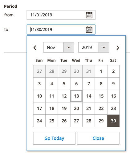
DateRange
This is an example of how to add a date range filter type:
1
2
3
4
5
6
7
8
9
10
<listing>
    <columns>
        <column name="period">
            <settings>
                <filter>dateRange</filter>
                <label translate="true">Period</label>
            </settings>
        </column>
    </columns>
</listing>
Result
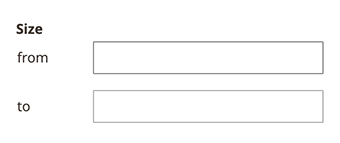
TextRange
This is an example of how to add a text range filter type:
1
2
3
4
5
6
7
8
9
10
<listing>
    <columns>
        <column name="size">
            <settings>
                <filter>textRange</filter>
                <label translate="true">Size</label>
            </settings>
        </column>
    </columns>
</listing>
Result