DropdownDialog widget
Magento dropdownDialog widget is a customization of the standard jQuery UI Dialog. As extra functionality it implements the following:
- triggering event for opening
- delaying to automatically close the drop-down on mouse out
- clicking outside the area closes the drop-down
The dropdownDialog widget source is located in lib/web/mage/dropdown.js.
Initialize the dropdownDialog widget
For information about how to initialize a widget in a JS component or .phtml template, see the Initialize JavaScript topic.
Options
Magento customized Dialog widget has default jQuery UI Dialog widget options, plus several custom options:
- autoPosition
- autoSize
- autoOpen
- closeOnClickOutside
- closeOnMouseLeave
- createTitleBar
- defaultDialogClass
- dialogContentClass
- parentClass
- timeout
- triggerClass
- triggerEvent
- triggerTarget
Description of each option as follows below location.
autoPosition
Specifies if the position option is used for calculating the drop-down offset.
If set to false (default value), then position rules are not used and the drop-down is positioned under the element for which the widget is initialized. Otherwise the drop-down offset is calculated using the position rules.
Type: Boolean
Default value: false
autoOpen
Specifies if the drop-down should open after page load.
Type: Boolean
Default value: false
autoSize
Specifies if the size of the drop-down is defined by widget options (height, width, minHeight, minWidth).
Type: Boolean
Default value: false
closeOnMouseLeave
Specifies if the drop-down is closed when mouse pointer is moved out.
Type: Boolean
Default value: true
closeOnClickOutside
Specifies if the drop-down is closed on mouse click outside the drop-down.
Type: Boolean
Default value: true
createTitleBar
Defines if the title option is used for displaying the title bar.
Type: Boolean
Default value: false
defaultDialogClass
Class that is added to the drop-down, when it gets initialized.
Type: String
Default value: mage-dropdown-dialog
dialogContentClass
Class that is added/removed on drop-down content when it gets opened/closed.
Type: String
Default value: null
parentClass
Class that is added/removed for the dropdown parent, when the drop-down gets opened/closed.
Type: String
Default value: null
triggerClass
Class that is added/removed on the trigger element when the drop-down gets opened/closed.
Type: String
Default value: null
triggerEvent
Name of the event that triggers the open() function for drop-down.
Type: String
Default value: click
triggerTarget
Element that triggers the drop-down.
Type:
- String
- jQuery object
Default value: null
timeout
The number of milliseconds until the dropdown is closed after mouse pointer moves out.
Type: Number
Default value: 500
Methods
Magento customized dropdownDialog widget has default jQuery UI Dialog widget methods, though some of them are customized.
Customized public methods:
open()
Beside default functionality, this method calls the _mouseLeave() and _mouseEnter() functions, adds classes on trigger and drop-down parent, and binds the close on mouse click outside drop-down to the <body> element.
Invoke the open method:
1
$("#element").dropdownDialog("open");
close()
Beside default functionality, this method removes the classes from trigger and drop-down parent.Also clears the timeout if the latter exists.
Invoke the close method:
1
$("#element").dropdownDialog("close");
Code sample
The following example shows how to initialize the dropdown dialog widget and pass options during the initialization. This example uses some CSS classes that are used for minicart.
1
2
3
4
5
6
7
8
9
10
11
12
13
14
15
16
17
18
19
20
21
22
23
<div data-block="dropdown" class="minicart-wrapper">
    <button type="button" class="action" data-trigger="trigger">
        <span data-bind="i18n: 'Click Here'"></span>
    </button>
</div>
<div class="block block-minicart"
     data-mage-init='{
        "dropdownDialog": {
            "appendTo": "[data-block=dropdown]",
            "triggerTarget":"[data-trigger=trigger]",
            "timeout": 2000,
            "closeOnMouseLeave": false,
            "closeOnEscape": true,
            "autoOpen": true,
            "triggerClass": "active",
            "parentClass": "active",
            "buttons": []
        }
     }'>
    <div id="minicart-content-wrapper">
        Here is our content
    </div>
</div>
The following example shows a PHTML file using the script and custom CSS classes that have no defined properties:
1
2
3
4
5
6
7
8
9
10
11
12
13
14
15
16
17
18
19
20
21
22
23
24
25
26
27
28
29
30
31
32
33
34
35
36
37
38
<?php
/** @var \Magento\Framework\Escaper $escaper */
?>

<div class="dropdown-wrap">
    <button class="dropdown-button">
        <span><?= $escaper->escapeHtml(__('Dropdown open button')) ?></span>
    </button>
    <div id="dropdown-dialog" data-role="dropdownDialog">
        <?= $escaper->escapeHtml(__('Dropdown content')) ?>
    </div>
</div>

<script type="text/javascript">
    require([
        'jquery',
        'dropdownDialog'
        ], function($, dropdownDialog) {
            'use strict';

            $('#dropdown-dialog').dropdownDialog({
                appendTo: '.dropdown-wrap',
                triggerTarget: '.dropdown-button',
                closeOnMouseLeave: false,
                closeOnEscape: true,
                timeout: 2000,
                triggerClass: 'active',
                parentClass: 'active',
                buttons: [{
                    text: $.mage.__('Close'),
                    click: function () {
                        $(this).dropdownDialog("close");
                    }
                }]
            });
        }
    );
</script>
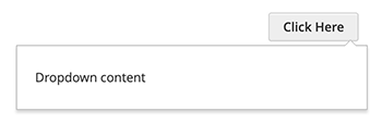
Result
The result is a dropdown dialog and a button (Click Here) that opens the dialog.