Modal widget
The Magento modal widget implements a secondary window that opens on top of the main window. It contains the overlay and modal content. The modal widget configuration enables the following:
- Configuring as popup or slide
- Controlling stack of modal widgets
- Setting buttons for action bar
The modal widget source is <Magento_Ui_module_dir>/view/base/web/js/modal/modal.js.
The widget uses the following templates:
<Magento_Ui_module_dir>/view/base/web/templates/modal/modal-popup.htmlpopup type template.<Magento_Ui_module_dir>/view/base/web/templates/modal/modal-slide.htmlslide type template.
The design patterns for the modal pop-up windows in the Admin are described in the Admin Pattern Library, the Slide-out Panels, Modal Windows, and Overlays topic.
Initialize the modal widget
To initialize the widget in your script, use the following general notation:
1
2
3
4
5
$('#modal_content').modal({
    <option1>: <value1>,
    <option2>: <value2>,
    ...
});
For details about how to initialize the widget in a.phtml template, refer to the JavaScript initialization topic.
Options
The modal widget has the following options:
- appendTo
- autoOpen
- buttons
- clickableOverlay
- closeText
- customTpl
- focus
- innerScroll
- modalAction
- modalClass
- modalCloseBtn
- modalContent
- modalLeftMargin
- modalSubTitle
- modalTitle
- modalVisibleClass
- outerClickHandler
- parentModalClass
- popupTpl
- responsive
- slideTpl
- subTitle
- title
- trigger
- type
appendTo
The element where the modal should be added.
Type: String
Default value: body
autoOpen
Automatically open the modal window when the widget is initialized.
Type: Boolean
Default value: false
buttons
Array of buttons for action pane.
Type: Array
Structure:
1
2
3
4
5
buttons: [{
    text: '',
    class: '',
    click: function () {} //handler on button click
}]
Default value:
1
2
3
4
5
6
7
buttons: [{
    text: $.mage.__('Ok'),
    class: '',
    click: function () {
        this.closeModal();
    }
}]
clickableOverlay
Close the modal window when a user clicks on the overlay.
Type: Boolean
Default value: true
closeText
The close button text.
Type: String
Default value: $.mage.__('Close')
customTpl
The template file that is used as content for the custom modal type.
Type: String
Default value: ui/template/modal/modal-custom.html
focus
Selector to focusing when a modal window opens or ‘none’ if focusing is not necessary.
Type: String
Default value: [data-role="closeBtn"]
innerScroll
Modal scroll position.
Type: Boolean
Default value: false
modalClass
Custom classes for modal window.
Type: String
Default value: empty
modalAction
The selector for all the custom action buttons.
Type: String
Default value: [data-role="action"]
modalCloseBtn
The selector for all the elements that can close the modal.
Type: String
Default value: [data-role="closeBtn"]
modalContent
The selector for element that is used for the modal’s content.
Type: String
Default value: [data-role="content"]
modalLeftMargin
Sets a margin between slide modal windows.
Type: Number
Default value: 45
modalSubTitle
The modal subtitle element selector.
Type: String
Default value: [data-role="subTitle"]
modalTitle
The modal title element selector.
Type: String
Default value: [data-role="title"]
modalVisibleClass
The class that is assigned to an opened modal.
Type: String
Default value: _show
parentModalClass
The class that is assigned to parent when the modal is opened.
Type: String
Default value: _has-modal
outerClickHandler
The function that handles a click outside the modal window. If the outerClickHandler option is not specified, the closeModal() method is used for handling a click outside the modal window.
Type: Function
Default value: undefined
popupTpl
The template file that is used as content for the popup modal type.
Type: String
Default value: ui/template/modal/modal-popup.html
responsive
Turn popup modal window to slide panel on small screens. Available if the type option is set to ‘popup’.
Type: Boolean
Default value: false
slideTpl
The template file that is used as content for the slide modal type.
Type: String
Default value: ui/template/modal/modal-slide.html
subTitle
Translated subTitle for the popup window that will be appended to the title.
Type: String
Default value: empty
title
Translated title for popup window.
Type: String
Default value: empty
trigger
The element that triggers the modal.
Type: String
Default value: empty
type
The type of window: ‘popup’ or ‘slide’.
Type: String
Default value: popup
Methods
The modal widget has the following methods:
openModal()
Open the modal window.
1
$('#css-selector').modal('openModal');
closeModal()
Close the modal window.
1
$('#css-selector').modal('closeModal');
keyEventSwitcher()
Listens for key events and calls handler function if it exists.
toggleModal()
Toggles the modal window.
Events
The modal widget is subscribed to the following events:
You can listen to these events in two ways:
Use jQuery’s on function:
1
2
3
4
var modal = $('#modal_content').modal({...});
modal.on('modalclosed', function () {
    // Do some action when modal closed
});
Or assign a callback as a property when creating a modal instance:
1
2
3
4
5
6
$('#modal_content').modal({
    ...
    closed: function (){
       // Do some action when modal closed
    }
});
closed
Called when the modal window is closed.
opened
Called when the modal window is opened.
Keyboard navigation
- the ESC key: close the current modal window
- the TAB key: set focus to the next focusable element (looped inside the modal window)
- the SHIFT+TAB keys combination: set focus to the previous focusable element (looped inside the modal window)
Code sample
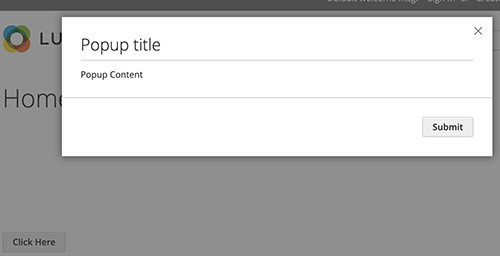
The following example shows how to initialize the modal widget and pass options during the initialization.
1
2
3
4
5
6
7
8
9
10
11
12
13
14
15
16
17
18
<button type="button" class="action" data-trigger="trigger">
    <span data-bind="i18n: 'Click Here'"></span>
</button>
<div data-bind="mageInit: {
        'Magento_Ui/js/modal/modal':{
            'type': 'popup',
            'title': 'Popup title',
            'trigger': '[data-trigger=trigger]',
            'responsive': true,
            'buttons': [{
                text: jQuery.mage.__('Submit'),
                class: 'action'
            }]
        }}">
    <div class="content">
        Popup Content
    </div>
</div>
The following example shows a PHTML file using the script:
1
2
3
4
5
6
7
8
9
10
11
12
13
14
15
16
17
18
19
20
21
22
23
24
25
26
27
28
29
30
31
32
33
34
35
36
<button id="button">
    <span><?= $block->escapeHtml(__('Click me')) ?></span>
</button>

<div id="modal">
    <div class="modal-body-content">
        <h2><?= $block->escapeHtml(__('Title')) ?></h2>
        <p><?= $block->escapeHtml(__('Content')) ?></p>
    </div>
</div>

<script type="text/javascript">
    require([
        "jquery",
        "Magento_Ui/js/modal/modal"
    ],function($, modal) {

        var options = {
            type: 'popup',
            responsive: true,
            title: 'Main title',
            buttons: [{
                text: $.mage.__('Ok'),
                class: '',
                click: function () {
                    this.closeModal();
                }
            }]
        };

        var popup = modal(options, $('#modal'));
        $("#button").click(function() {
            $('#modal').modal('openModal');
        });
    });
</script>
Result
The result is a modal and a button (Click Here) that opens the modal.